Styleguide Overview
This page is created automatically when the app starts and no styleguide page exists.
Use it as a visual QA checklist for core page-builder blocks, typography, imagery, buttons, cards, forms, and collection sections.
"Content" Block (H2)
Primarily Used as Editorial Blocks (H3)
Content areas available in Full, Half, 1/3, and 2/3 (H4)
This is a standard paragraph used to demonstrate body copy, line height, font size, spacing, and overall readability. The sample should be long enough to wrap across several lines.
Block quote: Thoughtful design helps people find the information they need while creating a consistent and recognizable experience across every page of a website.
This sentence contains bold text for emphasis within standard body copy. This sentence contains italic text for emphasis within standard body copy1. This sentence contains bold and italic text.
"Content" Block (H4)
1/2 Column 1 (H3)
Unordered List
- First list item
- Second list item
- Third list item
- Nested list item
- Another nested item
- Fourth list item
"Content" Block (H4)
1/2 Column 2 (H3)
Ordered List (Normal Text Bold)
- First step
- Second step
- Third step
- Nested step
- Another nested step
- Fourth step
"Columns" Block
The Columns Block provides a flexible way to organize related content into structured, side-by-side sections. Each column can include a title, description, content, image, and multiple links.
Columns can be configured to display 1, 2, 3, or 4 columns per row. When multiple columns appear together, their heights remain consistent and are determined by the tallest column in the row.
Columns Blocks do not have an "Intro Content" editor and will need a Content Block to list introductory text.
Column images are available in four different aspect ratios to accommodate a variety of content and layouts (This example uses the 1:1 square image format):
- 1:1 — Square
- 3:2 — Photo
- 4:3 — Standard
- 16:9 — Widescreen
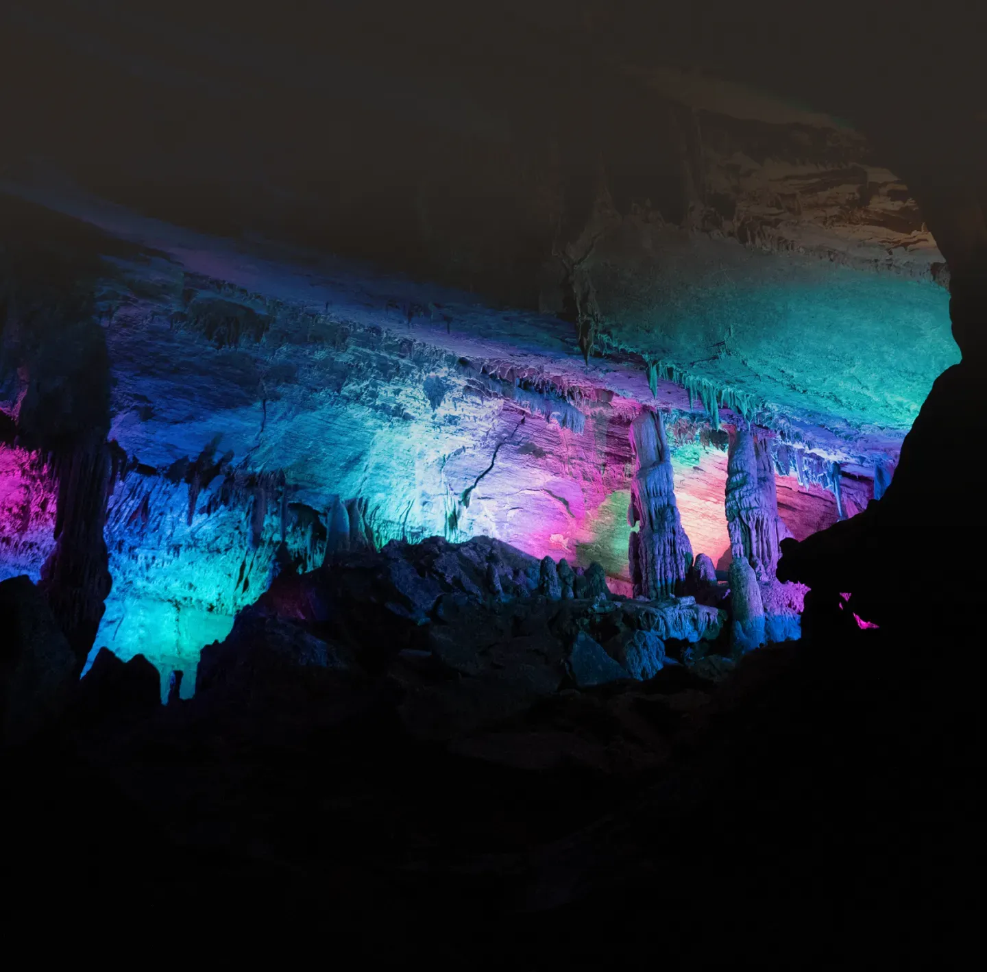
Column 1
Column Description
Column blocks include Title, Description, Content, Images, and multiple Links
Column 2
Column Description
Columns can have 1, 2, 3, or 4 columns in each row. The height stays fixed at the longest block. This example is 3 Columns wide.
Column 3
Column Description
Columns photos can have 4 different photo heights, include 16:9 and square. (This block is square).
Card Grids
Card Grids are similar to Column Blocks, and DO have an "Intro Content" editor that allows for content to span across the blocks.
This example is 4 columns wide.

Card Grids 1
A standard card with a custom link.
Card Grids include Title, Description, Content, Images, one Link, and Footer Text
Card Grids 2
A standard card with a custom link.
Card Grids can have 1, 2, 3, or 4 columns in each row. The height stays fixed at the longest block
Card Grids 3
A standard card with a custom link.
Card Grids photos can have 4 different photo heights, including 16:9 and square. (This block is 4:3).
Card Grids 4
A standard card with a custom link.
Card Grids can link:
- Internal documents/pages
- Custom URLs
- Media File / Download

Featured Blocks
Featured Blocks incorporate photos and are designed to serve as more visual, engaging links to additional content.
Featured Blocks do have an "Content" editor.
This example is 2 columns wide.
Featured Blocks
Featured Blocks include two Card Styles, Title, Description and Links. This is a Card Style Block
Featured Blocks
Featured Blocks can have 1 to 4 Columns and 1 Link. This example is 2 columns wide.
Image Overlay Example. The whole block becomes a link.
Width: Full Row
"Feature" Blocks
There are a few key differences between Features and Featured Blocks.
- Features are text-based and are best suited for highlighting key information, services, or benefits.
- Featured Blocks incorporate photos and are designed to serve as more visual, engaging links to additional content.
"Features" Blocks do not have an "Intro Content" editor and will need a Content Block to list introductory text.
This example is 3 columns wide.
Grid Layout Example
Blocks can have List or Grid form (this is a grid) and 2-4 columns.
Feature Block
Feature cards can explain capabilities without relying on imagery.
Feature Block Emoji
Blocks can feature and Emoji or Text in the top right corner
List Layout Example
Blocks can have List or Grid form (this is a grid) and 2-4 columns.
Feature Block
Feature cards can explain capabilities without relying on imagery.
Feature Block Emoji
Blocks can feature and Emoji or Text in the top right corner

Pre-heading Sample
Call To Action:Overlay on background Image
CTA blocks combine a bold heading, supporting copy, background media, and action links.
This block is "Content Width" - the same width as content blocks on the page.
Call To Action
(Right Position)
Pre-heading Sample
Call To Action:Feature Card with cTA
CTA blocks combine a bold heading, supporting copy, background media, and action links.
This block is "Content Width" - the same width as content blocks on the page.
Pre-heading Sample
Call To Action:Media with Content Split
CTA blocks combine a bold heading, supporting copy, background media, and action links.
This block is "Content Width" - the same width as content blocks on the page.
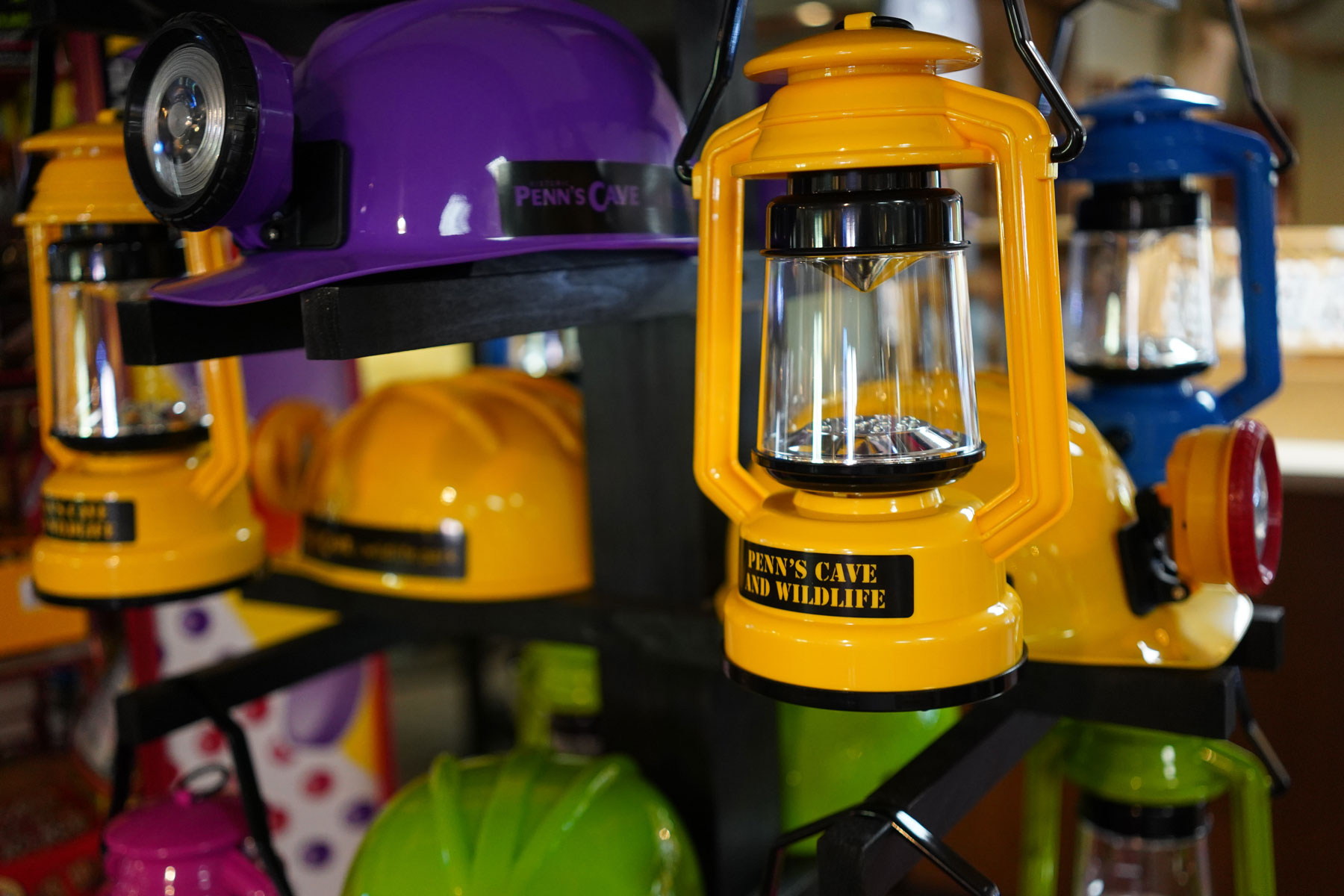
"Highlights Block" - Right
Card Description content is meant to call to action for the viewer.
"Highlights Block" - Left
Card Description content is meant to call to action for the viewer.
“Media” Block
The Media Block is a simple container designed for displaying a single image. Images can include both a caption and alt text for additional context and accessibility.
The Media Block does not include an introductory content editor and is not intended for displaying multiple images. When presenting a collection of photos, use a Gallery Block or Carousel Block instead.
"Media" Blocks do not have an "Intro Content" editor and will need a Content Block to list introductory text.

"Carousel" Block
Use carousel items for compact, visual storytelling. Each slide can pair an image with a short headline and supporting copy to highlight related content, features, or information.
- The Carousel Block provides an image-led way to highlight multiple pieces of content within a compact area of the page.
- Carousels can be configured with several image heights and can be set to auto-play or allow visitors to navigate manually using arrows.
- There is no limit to the number of slides that can be included in a carousel. For the best user experience, keep slide content concise and easy to read, particularly on smaller screens.
Carousel blocks are available in four different aspect ratios to accommodate a variety of content and layouts (This example uses the 1:1 square image format):
- 1:1 — Square
- 3:2 — Photo
- 4:3 — Standard
- 16:9 — Widescreen
"Carousel" Blocks do not have an "Intro Content" editor and will need a Content Block to list introductory text.

Carousel
Carousels can auto-play and have several image heights

Carousel 2
A second slide for navigation QA.
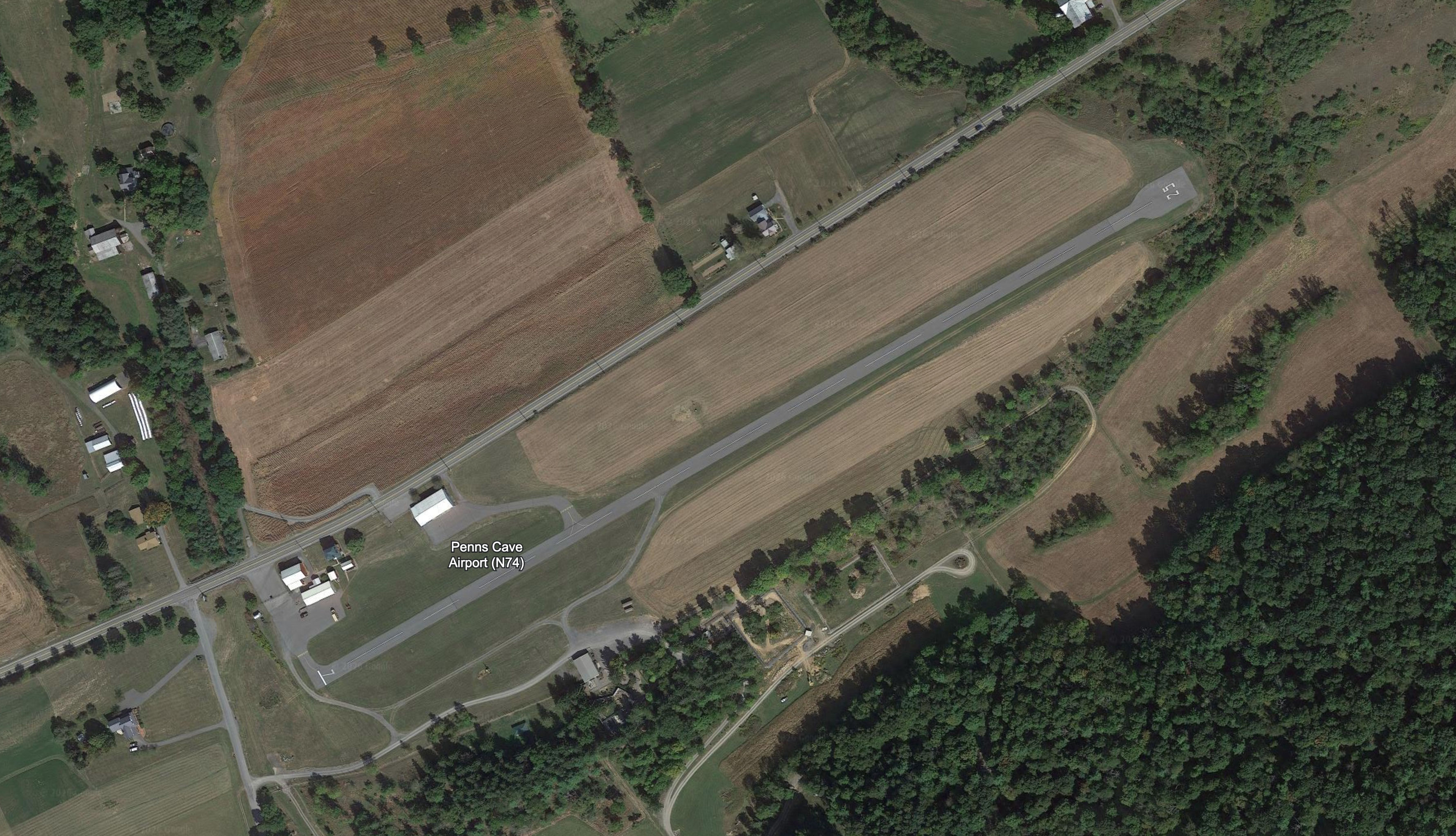
Carousel 3
A third slide checks looping behavior.
"Gallery" Block
- The Gallery Block provides a flexible way to display groups of images throughout the website.
- Galleries can be configured to display 2–4 images per row and are available in four different aspect ratios to accommodate a variety of image styles and layouts.
- A Featured Image can be used to give additional emphasis to a specific gallery item. Featured Images display larger than the other images in the gallery, helping draw attention to important or highlighted content.
"Gallery" Blocks do not have an "Intro Content" editor and will need a Content Block to list introductory text.
This example is 3 columns wide.

Timeline Block
The Timeline Block provides a structured way to present events, milestones, historical information, or other content in chronological order.
- Each timeline item can include a date, title, description.
- Timeline cards are position to the right of the timeline and can feature the year, text or emoji.
- Timeline Markers: By default, the date is used as the timeline marker. The marker can also be customized to display an emoji or text, making the Timeline Block suitable for content that may not follow a traditional date-based chronology.
Flexible Timeline Layout
Timeline cards are position to the right of the timeline and can feature the year, text or emoji.
Timeline Markers
By default, the date is used as the timeline marker. The marker can also be customized to display an emoji or text.
“Accordion” Block
The Accordion Block provides a compact way to organize larger amounts of content into expandable sections. Each accordion entry includes a title, description, and content field, with a WYSIWYG editor available for the main content.
There is no limit to the number of accordion entries that can be added. Accordions can be configured to allow multiple entries to remain open at the same time or to automatically collapse an open entry when another is selected.
“FAQ” Block
The FAQ Block functions similarly to the Accordion Block but is specifically structured for frequently asked questions. Each entry includes a Question and Answer field rather than the Title, Description, and Content fields used by Accordions.
There is no limit to the number of FAQ entries that can be added. FAQs can be configured to allow multiple answers to remain open at the same time or to automatically collapse an open answer when another question is selected.
"TABS" BLOCK
Highlighted heading
Individual tabs are displayed as large, rounded blocks in the right column. Each tab includes a Tab Title and can include an optional Summary—a short piece of supporting text that provides additional context for the active tab.
Selecting a tab updates the content displayed in the left column, allowing visitors to explore related information without leaving the section. The first tab is displayed as the default active tab when the page loads.
YouTube embed (demo ID)
"Video" Block
The Video Block provides a simple way to embed video content directly within a page. Videos can be added from YouTube, Vimeo, or a direct video source.
Use the Video Block for interviews, demonstrations, event footage, educational content, promotional videos, or other media that benefits from being viewed directly within the page.
Form Block
The default form block demonstrates the contact form inside page content.
“Testimonial” + “Quote” Blocks
“Testimonial” Blocks
The Testimonial Block provides a flexible way to highlight quotes, reviews, or endorsements throughout the website.
Each testimonial can include a quote, author name, role or position, and company. There is no limit to the number of testimonials that can be added.
Display Options
Testimonials can be displayed in two modes:
- Single — Displays an individual testimonial.
- Carousel — Displays multiple testimonials that visitors can cycle through.
The Testimonial Block can be displayed with or without a background, allowing it to work within a variety of page layouts and designs.
"Quote" Block
The Quote Block provides a subtle way to highlight a short editorial quote, statement, or excerpt within a larger section of content. It is designed to draw attention without becoming a distraction, using generous spacing and a more subdued presentation than the Testimonial Block.
While the Quote Block and Testimonial Block contain similar information, their primary difference is visual treatment and intended use. Testimonials are designed to prominently showcase endorsements or reviews, while Quote Blocks work best within editorial or long-form content.
Quote Fields
Each Quote Block can include:
- Quote — WYSIWYG content field for the featured quotation
- Author Name
- Role / Position
- Company
- Author Image
- Style — Choose between Large or Minimal
Display Styles
The Large style gives the quote greater visual emphasis, while the Minimal style provides a more understated treatment that integrates naturally with surrounding content.
The Testimonial Block provides a flexible way to highlight quotes, reviews, or endorsements throughout the website.
Each testimonial can include a quote, author name, role or position, and company. There is no limit to the number of testimonials that can be added.
Content Editor
Sample Role, Penn's Cave & Wildlife Park
Display Options
Testimonials can be displayed in two modes:
- Single — Displays an individual testimonial.
- Carousel — Displays multiple testimonials that visitors can cycle through.
The Testimonial Block can be displayed with or without a background, allowing it to work within a variety of page layouts and designs.
Developer
Sample Role, 3twenty9
Quote Block - Large
The Quote Block provides a subtle way to highlight a short editorial quote, statement, or excerpt within a larger section of content. It is designed to draw attention without becoming a distraction, using generous spacing and a more subdued presentation than the Testimonial Block.
Quote Block - Minimal
The Quote Block provides a subtle way to highlight a short editorial quote, statement, or excerpt within a larger section of content. It is designed to draw attention without becoming a distraction, using generous spacing and a more subdued presentation than the Testimonial Block.
"Team" Block
The Team Block is designed to highlight individual profiles for team members, staff, authors, board members, leadership, or other individuals who require recognition on the website.
The Team Block contains individual Team Member sub-blocks, with no limit to the number of profiles that can be added.
Team Member Fields can include:
- Name
- Role / Position
- Bio
- Photo
- Email Address
- Social Media Links
Display Options
Team members can be displayed using either a Grid or Row layout, depending on the amount of information being presented and the desired visual treatment.
The Grid layout can be configured to display 2, 3, or 4 team members per row. This example uses a two-column layout.
Use the Team Block for content where individual identity, role, and biographical information are important, while maintaining a consistent presentation across multiple profiles.
"Team" Blocks do not have an "Intro Content" editor and will need a Content Block to list introductory text.

"Team" Block
Content Editor
The Team Block contains individual Team Member sub-blocks, with no limit to the number of profiles that can be added.
Display Options
Collections Manager
The Grid layout can be configured to display 2, 3, or 4 team members per row. This example uses a two-column layout.
PARTNERS - Sample Subtitle
“Logos” Block

"Numbers" Block
The Numbers Block provides a bold, eye-catching way to highlight statistics, milestones, and other key data. It is especially effective for showcasing fundraising impact, membership totals, event participation, organizational growth, or other measurable achievements.
The block can include a Subtitle / Eyebrow Text, Block Title, and Background Image.
Number Items
There is no limit to the number of Number Items that can be added. When the block loads, each value uses a count-up animation, drawing attention to the featured statistics.
Each Number Item includes:
- Value — Required numerical value
- Suffix — Optional text displayed after the value, such as + or %
- Subtitle — Supporting text displayed below the number, such as “Creative Projects Launched”
For the greatest visual impact, use the Numbers Block to feature a small selection of meaningful statistics that can be understood at a glance.

Numbers - Sample Subtitle
"Numbers" Block
LAYOUT BLOCKS ON THIS PAGE
SEEDED DEMO DATA
“Pricing Table” Block
The Pricing Table Block provides a clear, easy-to-compare way to display membership levels, subscription plans, dues, or other pricing options. It can accommodate monthly, yearly, one-time, or other pricing structures.
“Pricing Table” Block
$329 / /yearExample membership tiers
- The Pricing Table Block provides a clear, easy-to-compare way to display membership levels, subscription plans, dues, or other pricing options
- "Pricing Table" Blocks do not have an "Intro Content" editor and will need a Content Block to list introductory text.
- There is no limit to the number of plans that can be added to a Pricing Table.
Highlighted Plan
$1,826 / /yearHighlighted Plan example tier
- An individual plan can be highlighted to give it greater visual emphasis
- Use the Pricing Table Block when visitors need to quickly compare pricing, features, and benefits across multiple options.
- Use the Pricing Table Block when visitors need to quickly compare pricing, features, and benefits across multiple options.
"Menu" Block
Menu Example
Section Title
Section Description
Item Name
3Item Description
Item name 2
2Item Description
Item name 3
3Item Description
Archive block
Posts from the collection (limit 3 for the demo).
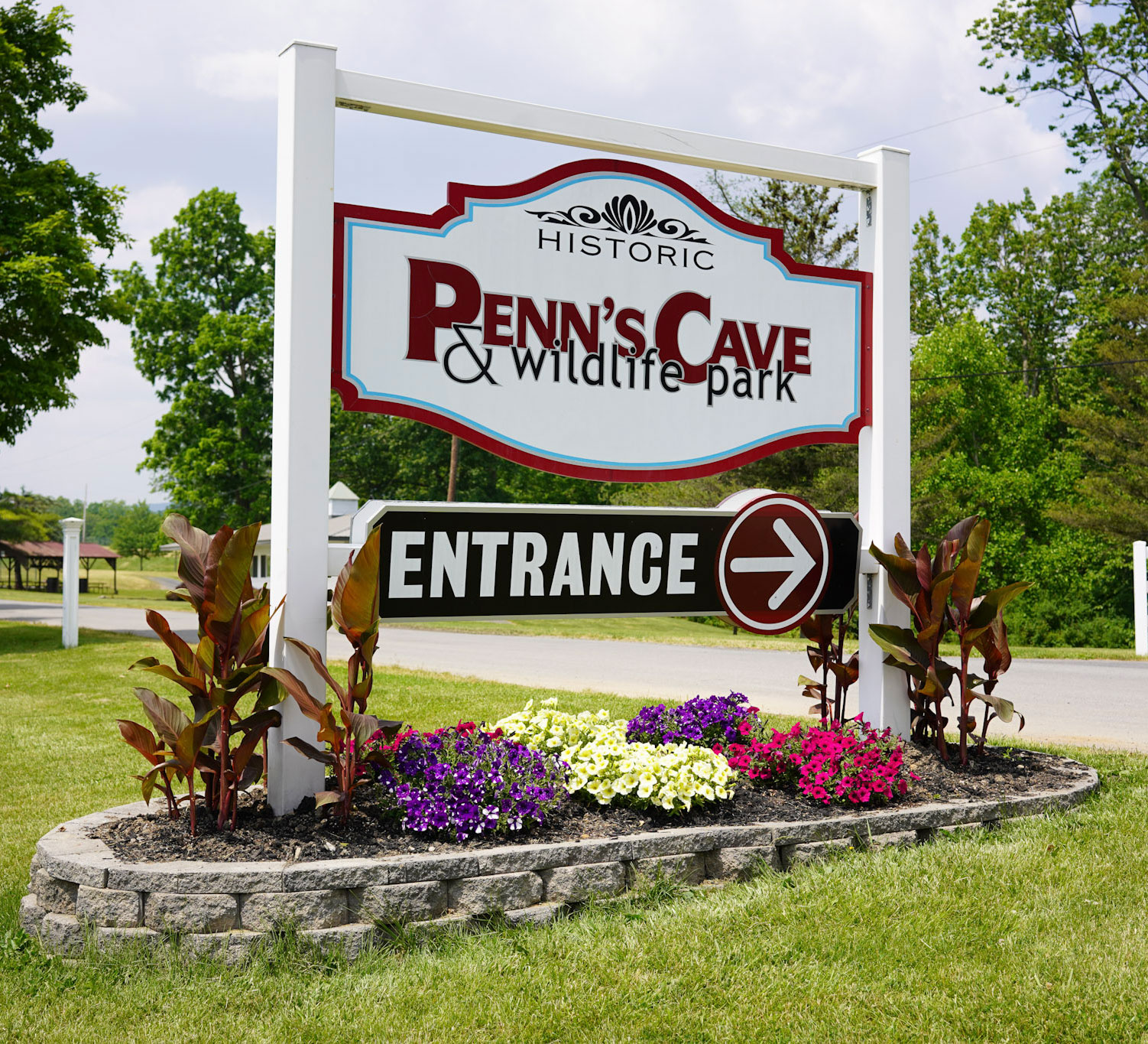
Penn's Cave was proud to welcome families, outdoor enthusiasts, and conservation partners for the Wildlife for Everyone Foundation's Great Outdoor Picnic held on June 20.

Penn's Cave is proud to support the important work of Gentled Hearts Stable and invites the community to attend the DG Mustang Challenge, taking place September 18–19, 2026, at the Grange Park Equine Center in Centre Hall, Pennsylvania.
Banner block — informational style variant.
1export const styleguideSlug = 'styleguide'2
Visitors Center Hours
March
Visitor Center
Daily: 11AM - 5PM
April
Visitor Center
Daily: 10AM - 5PM
May
Visitor Center
Daily: 9AM - 5PM
June
Visitor Center
Daily: 9AM - 5PM
July
Visitor Center
Daily: 9AM - 5PM
August
Visitor Center
Daily: 9AM - 5PM
September
Visitor Center
Daily: 9AM - 5PM
October
Visitor Center
Daily: 10AM - 5PM
November
Visitor Center
Daily: 11AM - 5PM
December
Visitor Center
Cavern Tours Schedule
Cavern Temperatures 52° year round.
March
Hourly Tours
Daily: 11AM - 4PM (Last tour at 4pm)
April
Hourly Tours
Daily: 10AM - 4PM (Last tour at 4pm)
May
Hourly Tours
Daily: 9AM - 5PM (Last tour at 5pm)
June
Hourly Tours
Daily: 9AM - 5PM (Last tour at 5pm)
July
Hourly Tours
Daily: 9AM - 5PM (Last tour at 5pm)
August
Hourly Tours
Daily: 9AM - 4PM (Last tour at 4pm)
September
Hourly Tours
Daily: 9AM - 4PM (Last tour at 4pm)
October
Hourly Tours
Daily: 10AM - 4PM (Last tour at 4pm)
November
Hourly Tours
Daily: 11AM - 4PM (Last tour at 4pm)
December
Hourly Tours
FARM-NATURE-WILDLIFE Tour Schedule
FARM-NATURE-WILDLIFE Park is closed December 1 to March 31
April
Tours
Daily: 11AM, 1PM & 3PM
May
Weekday Tours
Daily: 11AM, 1PM & 3PM
Weekend Tours
June
Weekday Tours
Daily: 11AM, 1PM & 3PM
Weekend Tours
July
Tours
Daily: 11AM - 4PM Hourly departure
August
Weekday Tours
Daily: 11AM, 1PM & 3PM
Weekend Tours
September
Weekday Tours
Daily: 11AM, 1PM & 3PM
Weekend Tours
October
Weekday Tours
Daily: 11AM, 1PM & 3PM